


Moviepass
What it was
MoviePass was the theatre going experience disrupter back when it arrived. The app and corresponding debit card allowed users to see unlimited movies in theatres for very low (too low) subscription cost. When I joined the company the app was about to go into hyper growth!
Why we did it
When I came to MoviePass the company was going through a transformative period of extreme growth and demand. This influx of users resulted in an overwhelming amount of customer care contacts that the small team could not handle. My job was to uncover the user pain points that resulted in CX contacts, and re-design the visually outdated app.
What I did
As the sole designer at the company I worked closely with our VP of product and iOS/Android engineers to launch new iOS and Android apps simultaneously.
Goal
Reduce the number of customer care contacts by re-designing the app, and make it more intuitive, user friendly, and visually engaging.
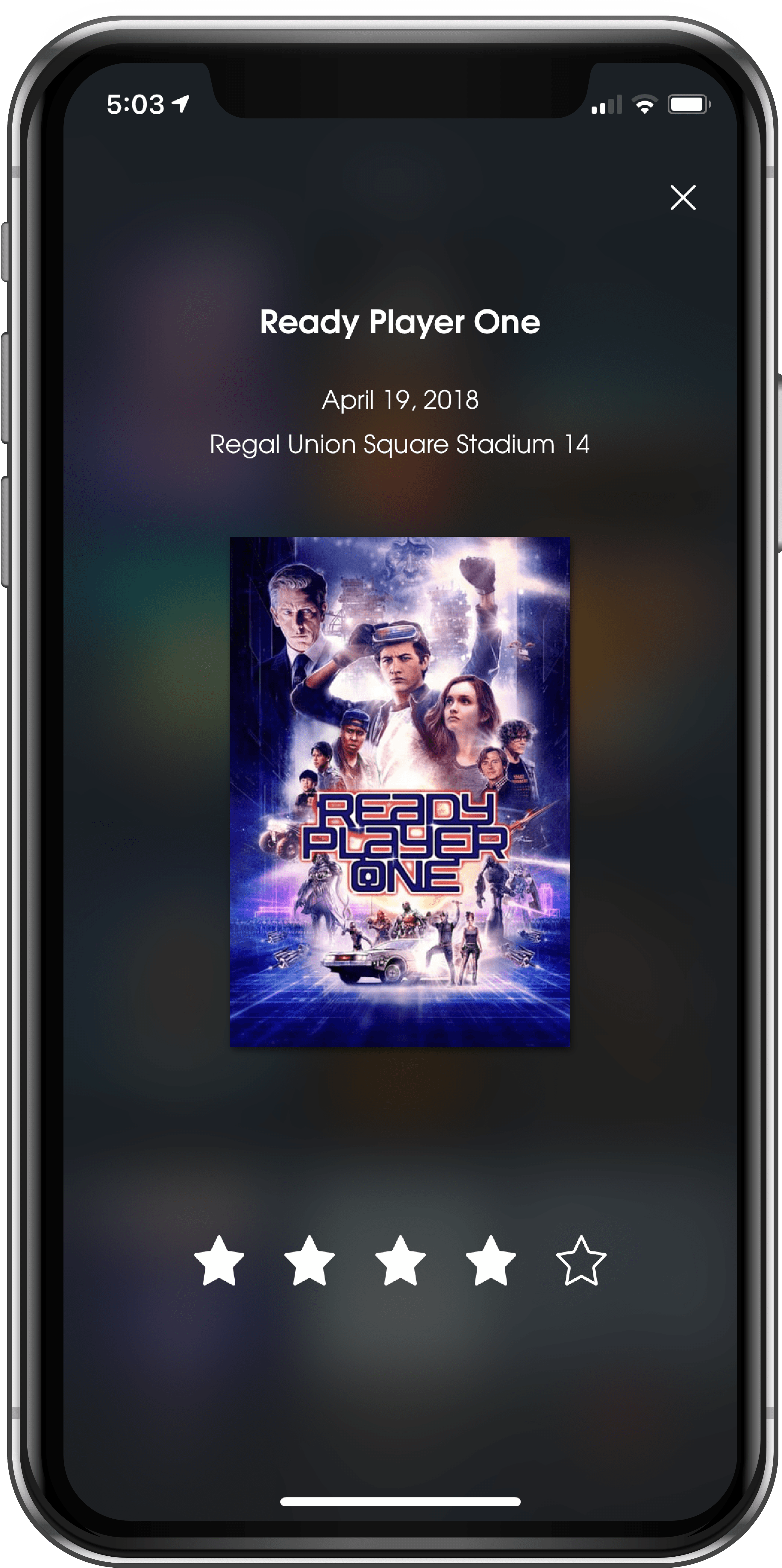
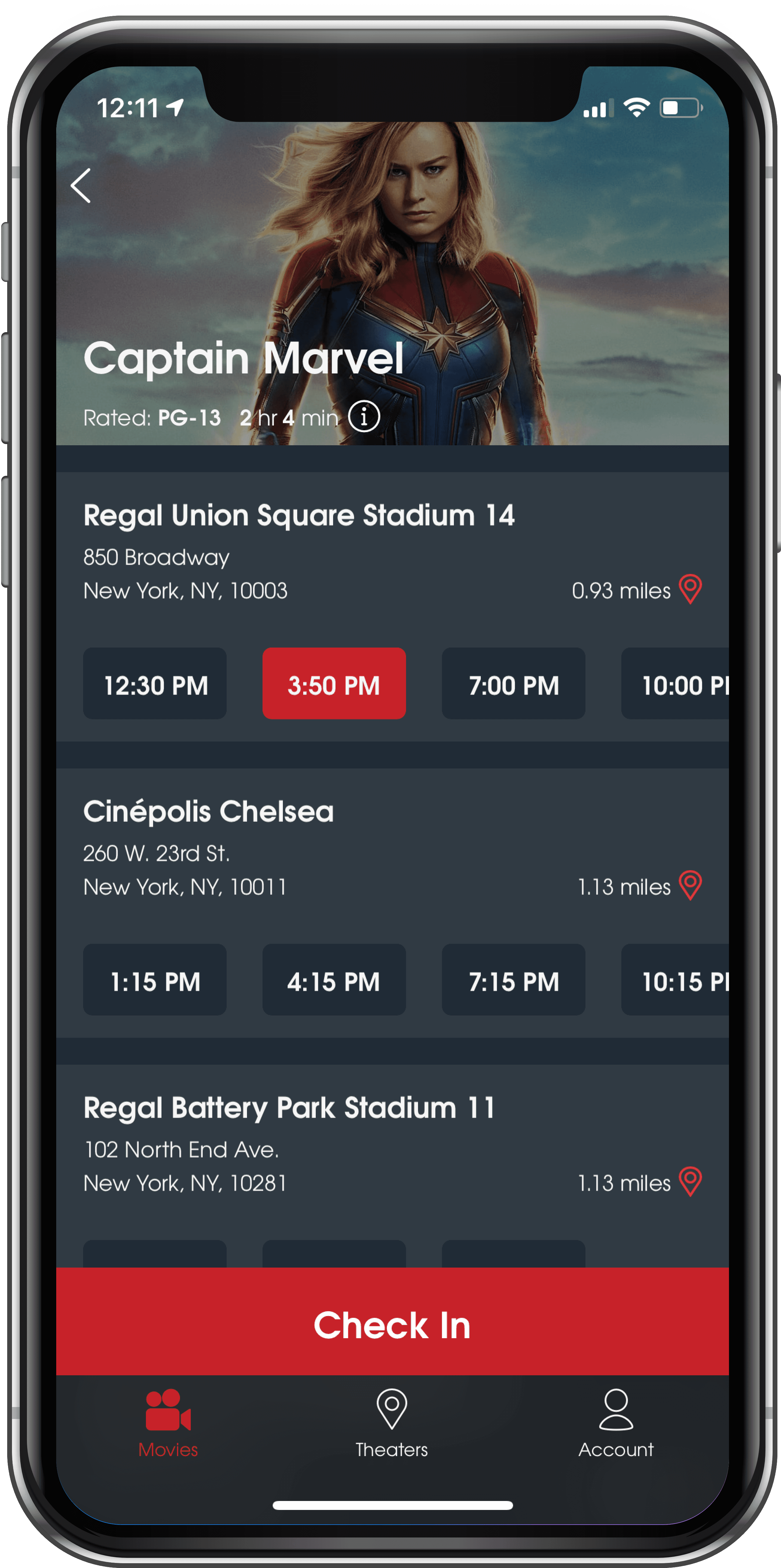
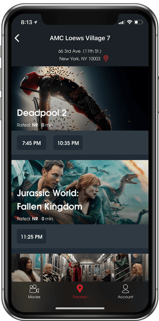
The Final Outcome
A sampling of final screens before getting into the process

The process
I spoke with our CX team and heard that the majority of CX tickets were related to users asking about the status on receiving their cards as well as how to activated their card.
From talking to customers and watching YouTube videos where users would demonstrate the check-in process, I uncovered pain points that could be eased by clearer onboarding and messaging within the check-in flow.

New Onboarding
Overall one big solve for reducing CX inbound volume would be to re-design the onboarding experience in the app. Onboarding is a crucial part of the MoviePass app since it explains to the user how they have to be at the theatre to check-in on the app, and how they have to actually swipe their card at the box office to get their ticket. Below are before and after screenshots of the app onboarding flow:
Old Onboarding UI

New Onboarding UI

Card Activation
After sign up, users were informed they were going to have activate their card once they received it, but this wasn't always the case. After a certain amount of time cards auto-activated, and users would call asking how they were supposed to activate, when they didn't need to. Auto-activated users would now receive a splash screen upon app entry informing them that their card was activated and ready to use.

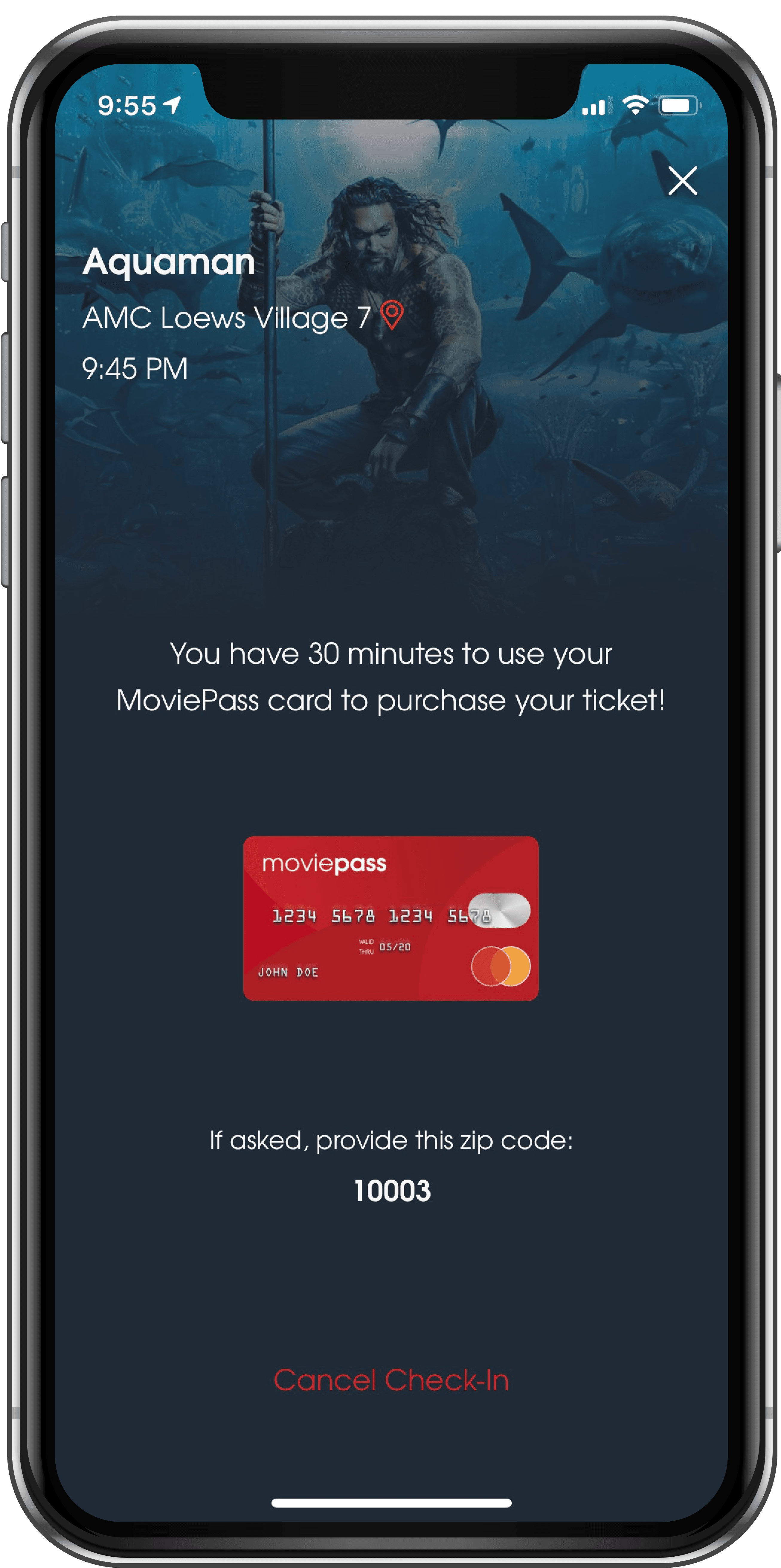
Checking In
There were two main issues that I wanted to address in the check-in flow. The first was clearer messaging regarding the user's location, the second was to convey to the user that they needed to use their card to "purchase" their ticket.

User Testing
I interviewed MoviePass users (and non users) outside movie theaters with a prototype of the new app in order to gauge the effectiveness of the new design as well as understand their pain points. I also did phone interviews with beta users of the new app new to get feedback for continual improvement.
Users thought the new version of the app was much easier to navigate, felt more seamless, and more clearly explained the check-in process. Users also commented on social media about how the UI was much sleeker.

Iteration
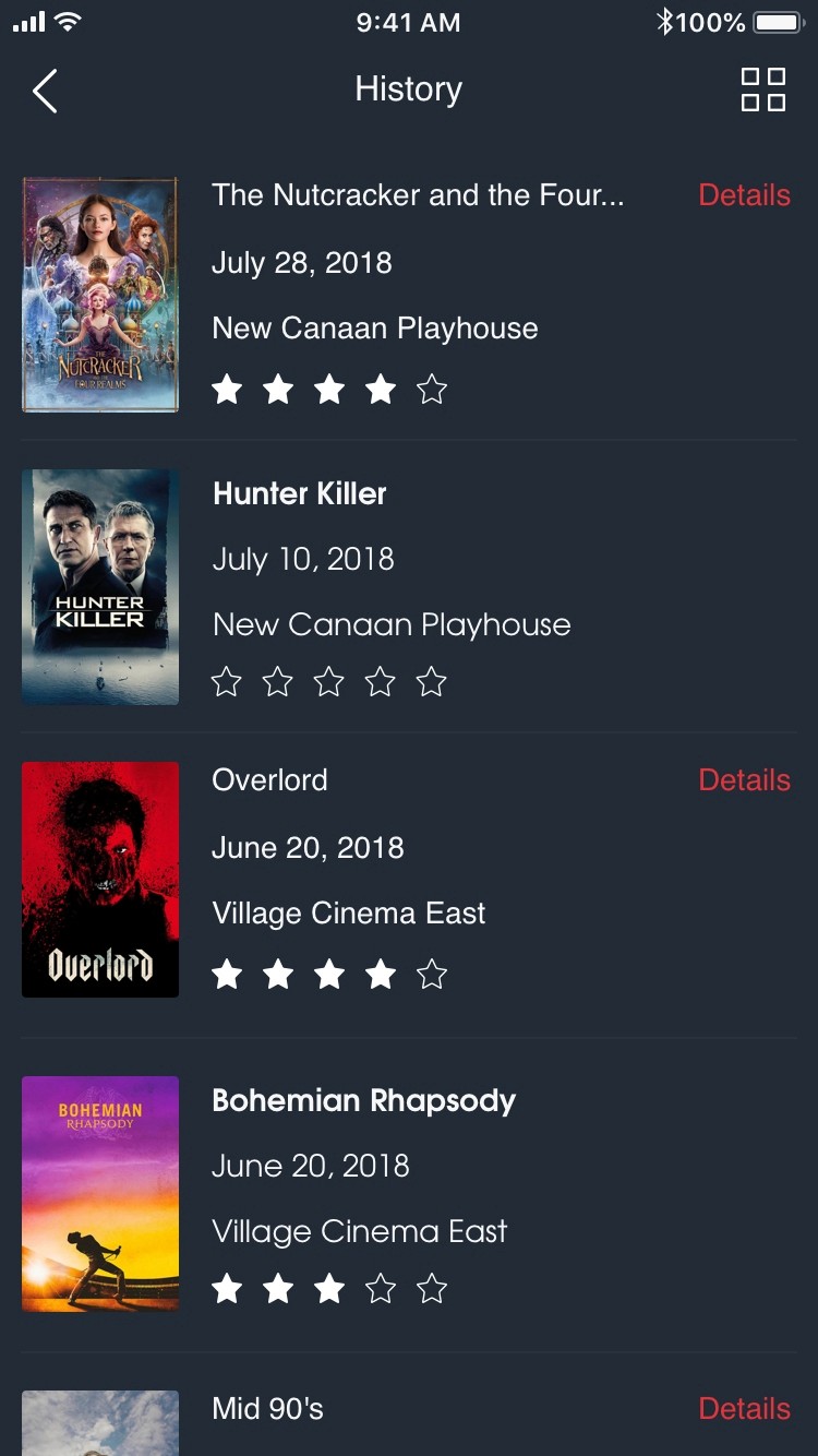
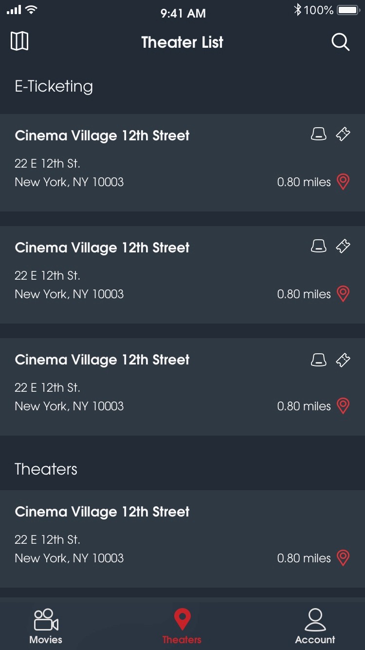
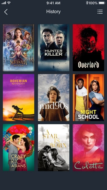
Acting on user feedback I iterated on the map/list screens and history screen. Users preferred the theater list being the default view, explaining that the map was more useful only when in a location unfamiliar to them, which was rare. Users also expressed their interest in bringing the history grid view back; I came to realize that this layout was preferred because it represented their movie going history in a way that sparked joy and a "gamification" of the product.

A New Look
The previous app UI was cluttered and disorienting, adding to a poor user experience. Only a few new movies premiere every week, and the app wasn't highlighting these new releases or showcasing movies in a persuasive way. I wanted the app to emphasize the movie artwork while guiding the user visually through their check-in process. Large format posters, cinematic coloring, and clear representation imagery were employed to achieve these goals.
Results
The feedback we received on the design through the reddit and other social media platforms was great. We also had a 70% reduction in customer care contacts regarding card activation. However, we still needed to improve the overall check-in process at the theaters, a problem I longed to tackle, but never got to (I left the company a few months before it closed its doors).

Future concepts
At MoviePass I constantly worked to improve our product, especially as the product offering changed for our user base. Below are some mocks and a prototype I did that aimed to offset the optics of low movie inventory/content on the home screen.


Feature Work
A sampling of features that came post MVP
Peak pricing & peak pass


