What it was

DailyPay, the leader in earned wage access, wanted to build a new app that would offer earned wage access for free, and bundle it with best in class neo-banking features.

Why we did it

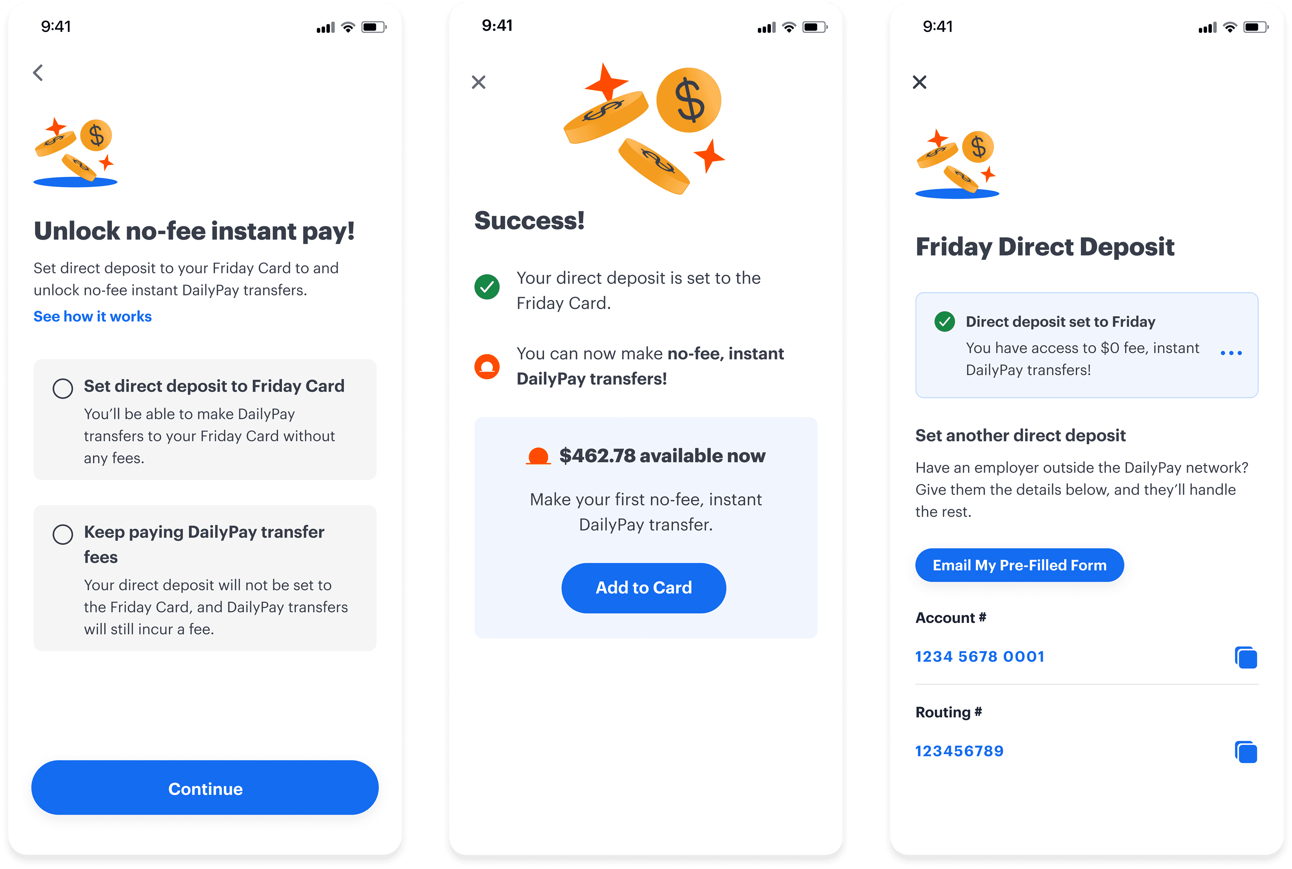
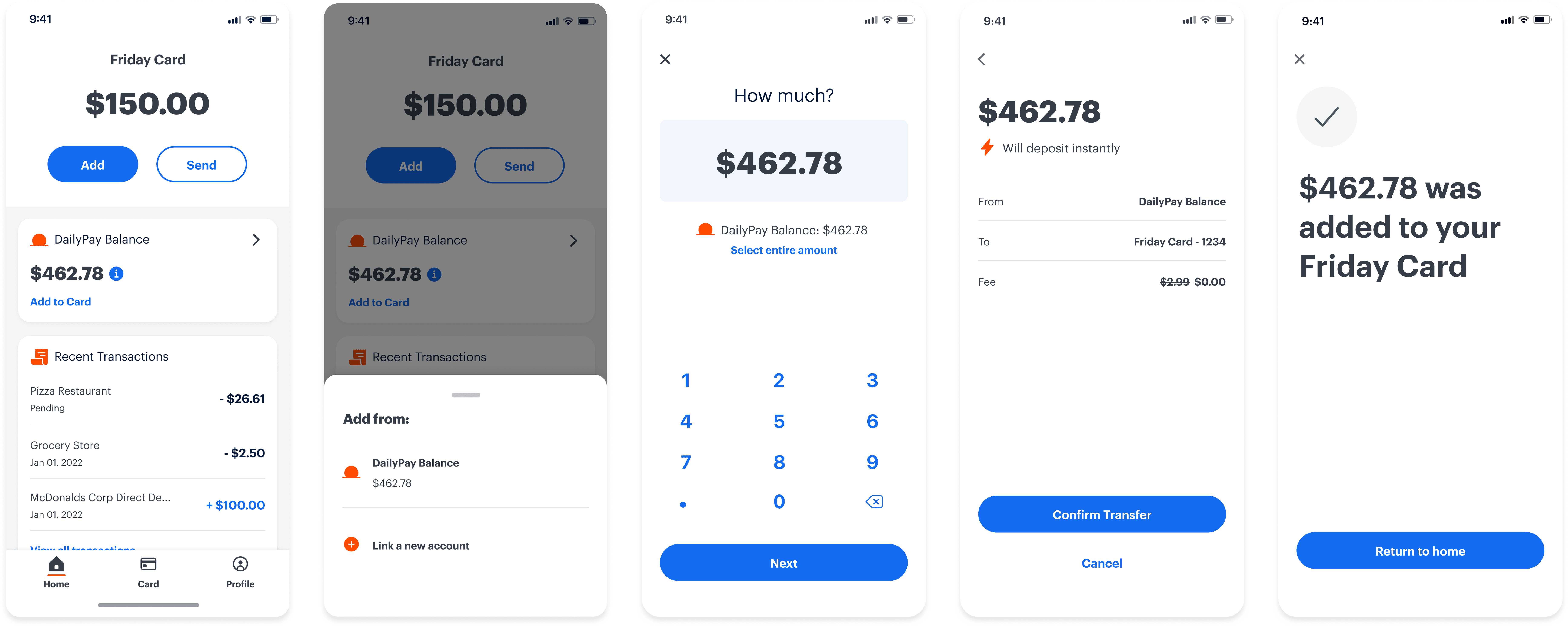
Relieve our users of the biggest friction point - transfers fees. Retain DailyPay users post job termination.
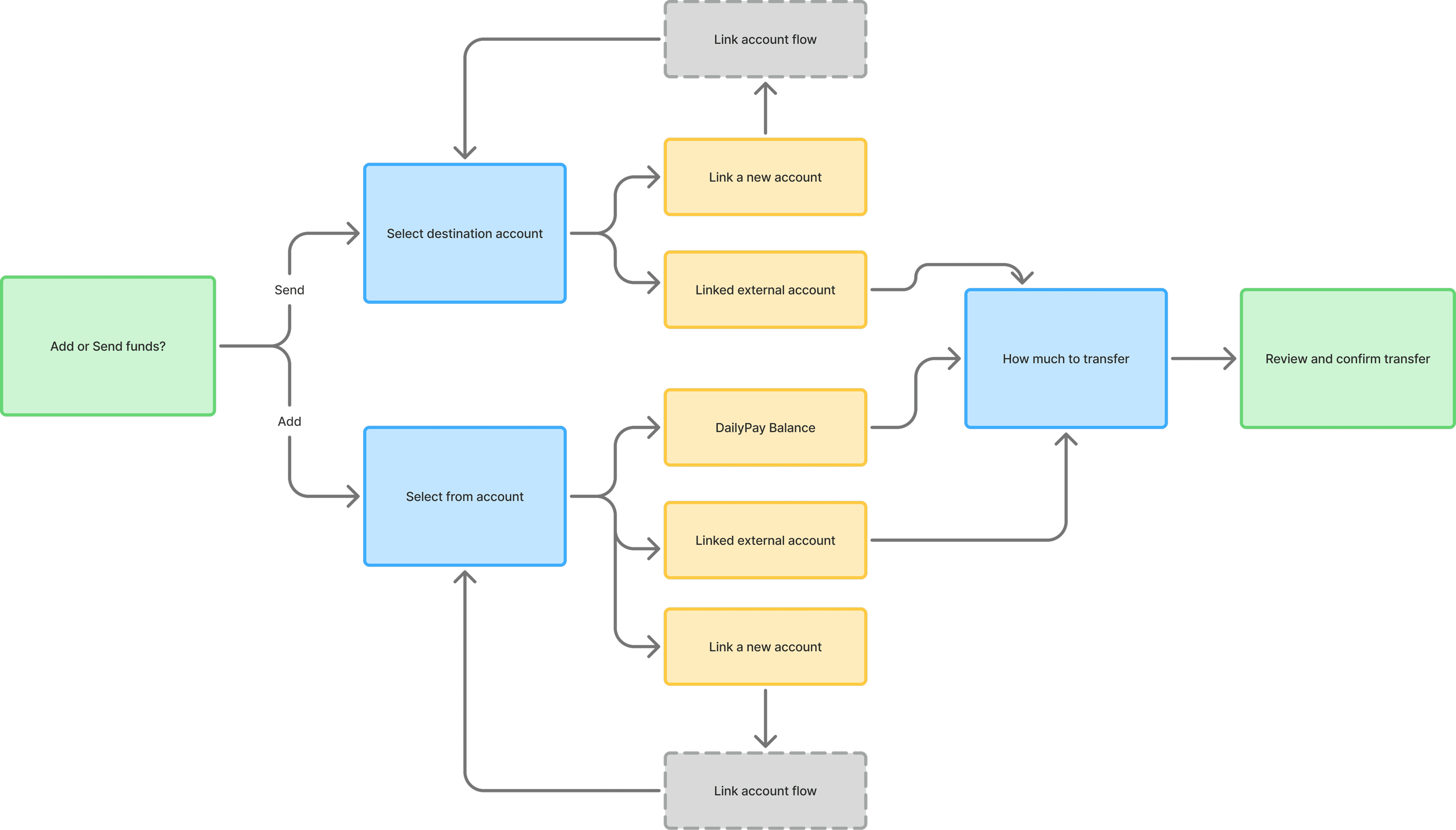
What I did

As the Lead Product Designer and Design Manager, I designed the app from the ground up, including UX research, UI design, user testing, brand design, debit card design, and the beginnings of a component library and design system. I also managed one product designer on the project.

What the results were

After launching this new app we achieved …

  • 4.9 stars on the App Store

  • 66% enrollment rate (greatly surpassing our goal metric)

  • 45% direct deposit switch rate (meeting our goal metric)

Overview

Full case study on request
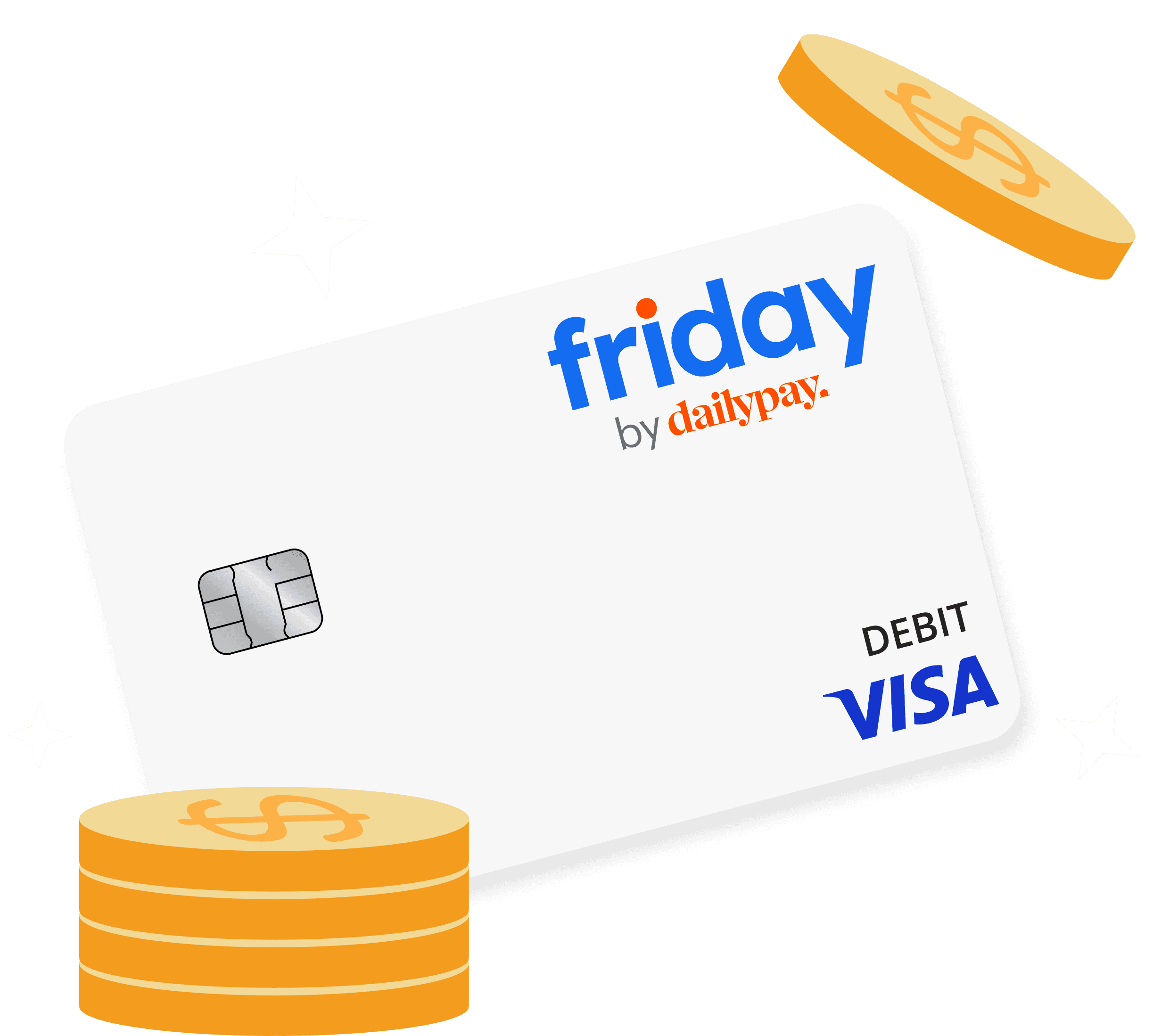
High level journey

High level journey

As a 0-1 project I started by wire framing the high level user journeys which included a card opening flow, a direct deposit enrollment flow, and a money transfer flow. This is a snapshot of the main user journey for the MVP.

As a 0-1 project I started by wire framing the high level user journeys which included a card opening flow, a direct deposit enrollment flow, and a money transfer flow. This is a snapshot of the main user journey for the MVP.

As a 0-1 project I started by wire framing the high level user journeys which included a card opening flow, a direct deposit enrollment flow, and a money transfer flow. This is a snapshot of the main user journey for the MVP.

User testing

User testing

User testing

I tested the first concepts by having users run through the main user journey of signing up, opening the card, enrolling in direct deposit, and making a transfer. This testing proved very valuable as it highlighted points of confusion and opportunities for better engagement.

I tested the first concepts by having users run through the main user journey of signing up, opening the card, enrolling in direct deposit, and making a transfer. This testing proved very valuable as it highlighted points of confusion and opportunities for better engagement.

I tested the first concepts by having users run through the main user journey of signing up, opening the card, enrolling in direct deposit, and making a transfer. This testing proved very valuable as it highlighted points of confusion and opportunities for better engagement.

Optimization

Optimization

I took the time to infuse a bit of joy into some of our onboarding screens after noticing that users weren't really focusing on the main value props in a sea of text. There was only one true value prop at the time of MVP, so I wasn't concerned with an automatic horizontal scroll that contained less valuable information, but gave the impression there was more than what meets the eye.

I took the time to infuse a bit of joy into some of our onboarding screens after noticing that users weren't really focusing on the main value props in a sea of text. There was only one true value prop at the time of MVP, so I wasn't concerned with an automatic horizontal scroll that contained less valuable information, but gave the impression there was more than what meets the eye.

Transactions

Interaction Design

A sampling of scroll behaviors I worked on:

Icons & theme exploration