

Bread - member's portal
What it was
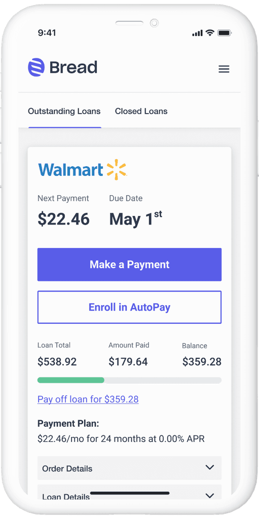
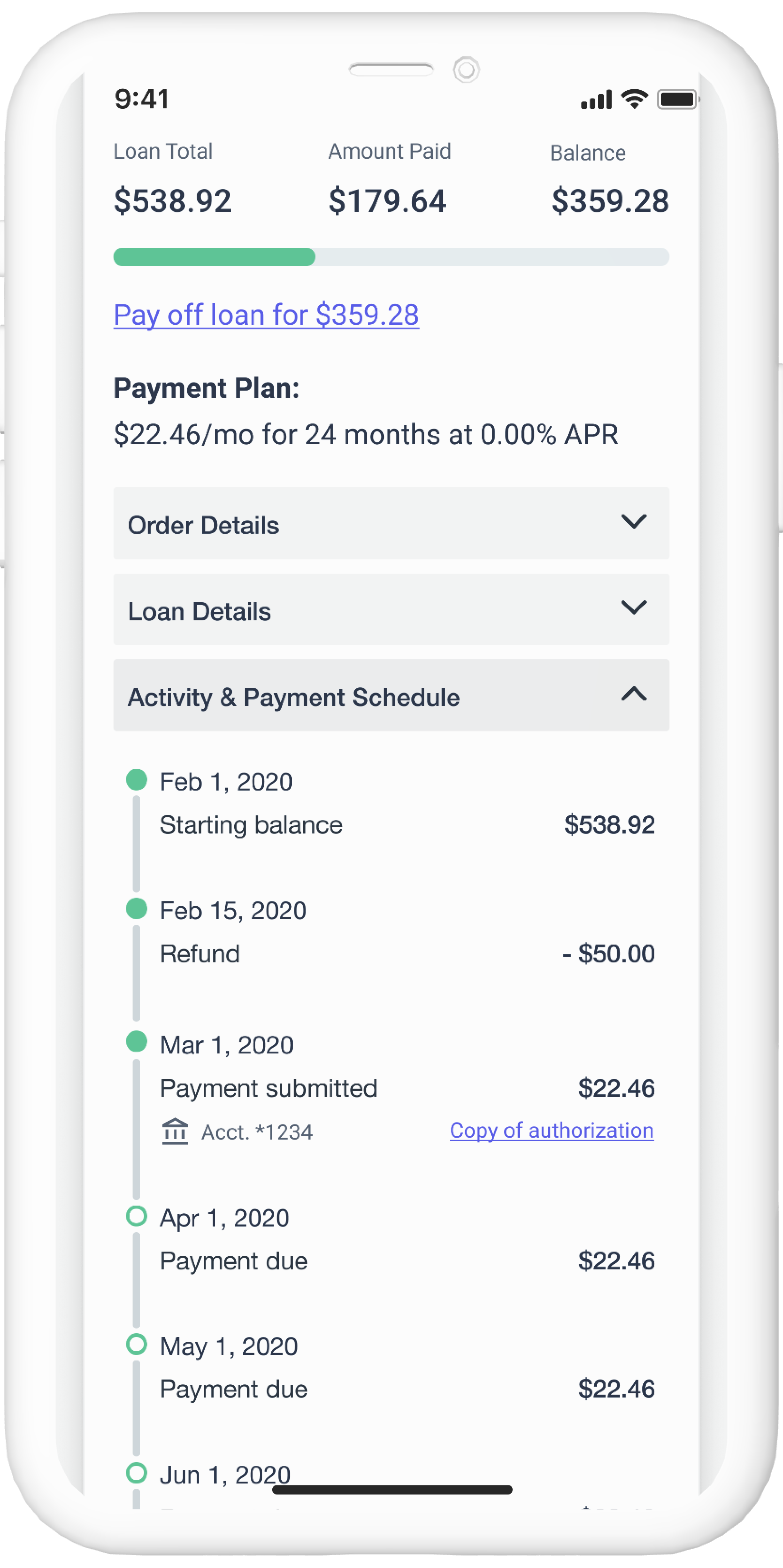
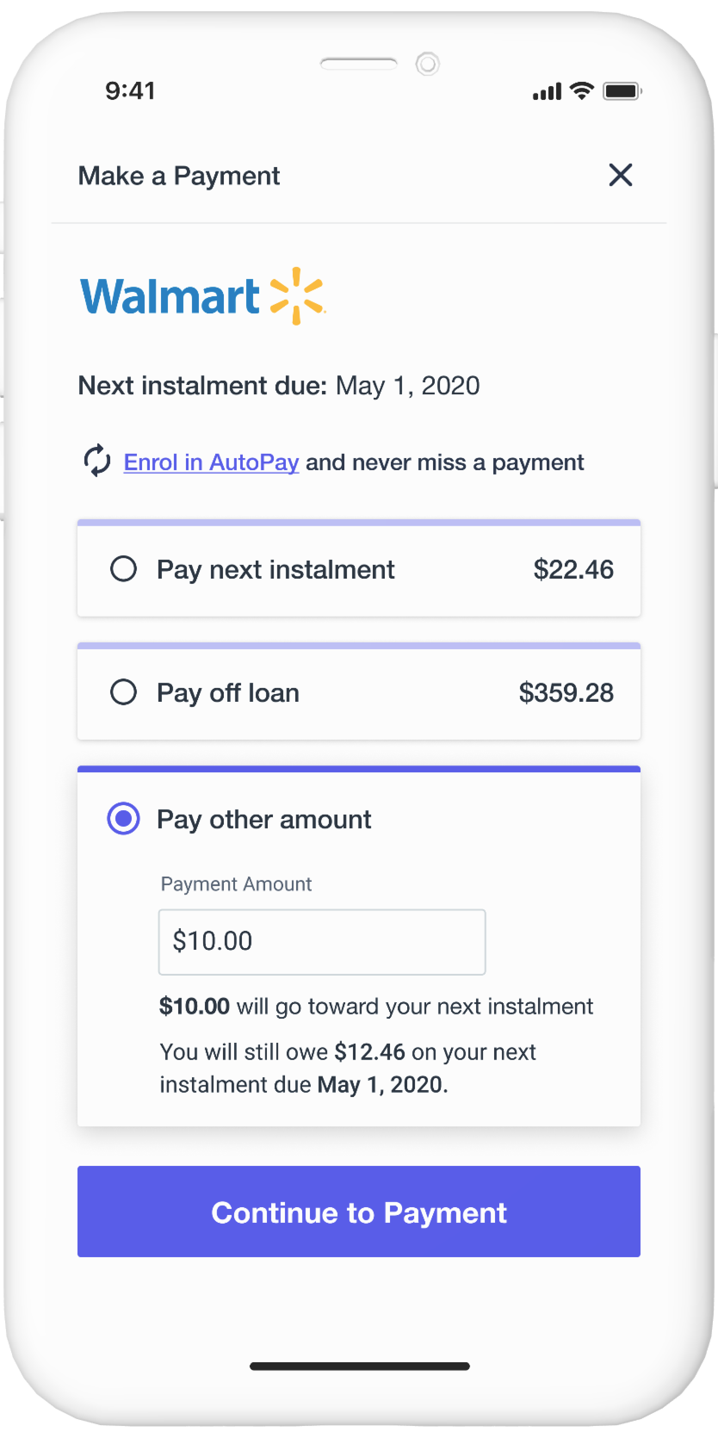
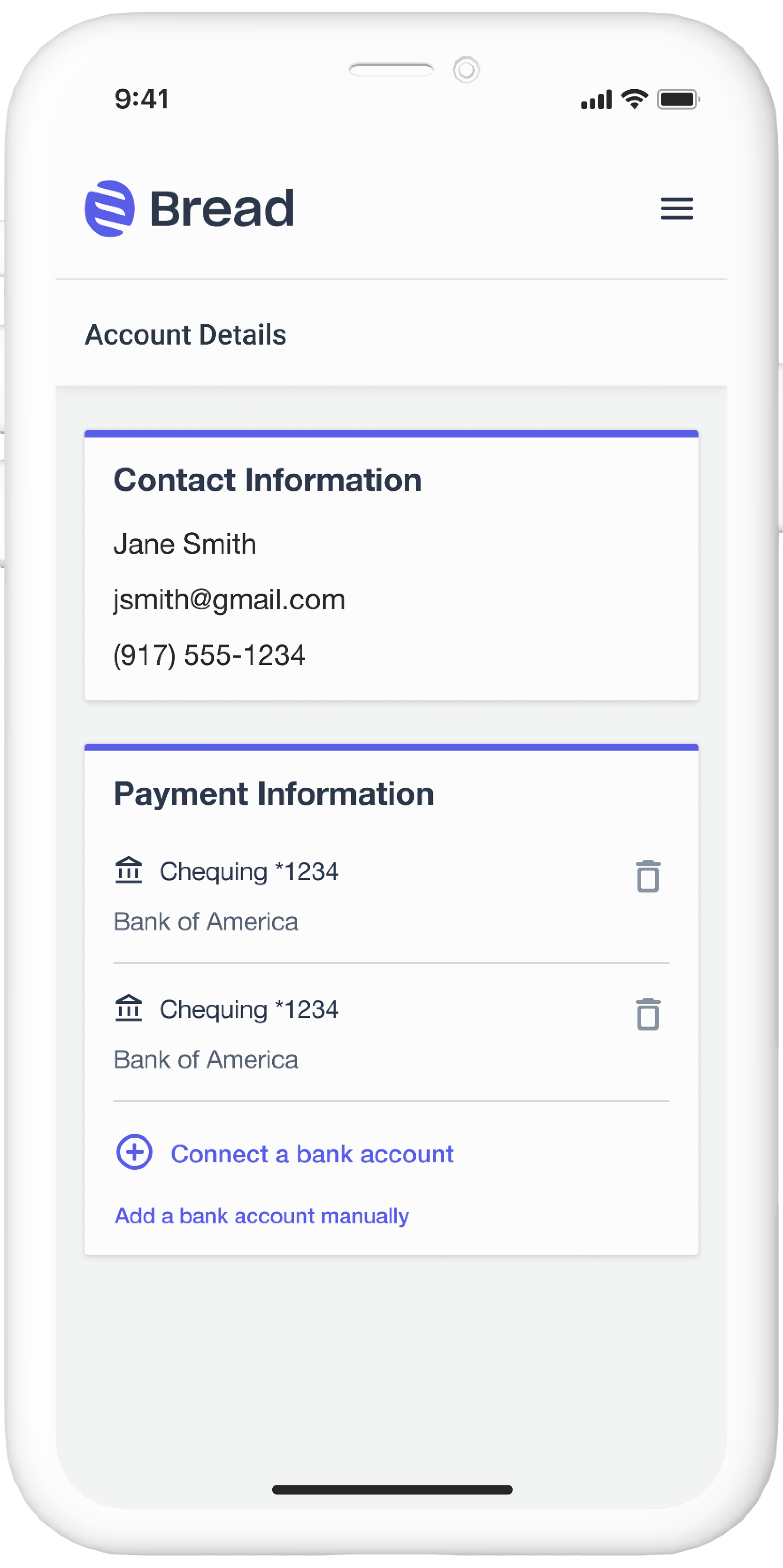
Bread, a merchant-first pay-over-time solution, allowed online retail stores to quickly add merchant branded buy now, pay later options to their checkout experiences. The member's portal was where customers could go to pay off their loans.
Why we did it
After signing a partnership with a world renowned bank, the company embarked on building Bread 2.0, which included a new member's portal that I was to take lead on for design.
What I did
I owned the design process, including UX research, UI design and usability testing. The team consisted of 1 Product Manager, 3 frontend engineers, and 1 engineering manager.
Goal
Our goal was to create a new portal that could scale with the business, be white labeled for any future partnerships, encourage timely repayments, and generally improve upon the existing portal's experience.
What We Knew
I started by working with our analytics team to uncover some key data points.
I also spoke with our customer operations team to hear about what issues our users were contacting them about.
What We Wanted To Know
We wanted to uncover any pain points or areas of friction that users have when interacting with the portal. We also wanted to get a better sense of why some users choose not to enroll in autopay, why certain aspects of making a prepayment could be confusing, and what features would be beneficial for Bread customers going forward.
User Survey
We conducted a survey of 1,000 + users who had interacted with the member's portal within the past 2 months.
Results not shown; under NDA
User Interviews
Because of the extremely tight deadline I only had 1 week to conduct user research. I recruited 10 Bread users who had interacted with the Member's Portal with the last month. My goal was to understand better any pain points within the portal, get more insight into why users do or don't enroll in AutoPay, and what users make of prepayments and paying "principal only".
Because our deadline was so tight, I was concepting while conducting this generative research. Thus, I was able to also show users some concepts at the end of the interviews to validate some assumptions, killing 2 birds with one stone.
Results not shown; under NDA

Key Takeaways
It's easy to use
Overall the feedback we received was positive in terms of the usability of the platform
UI needs to add clarity
Customers wanted to see their payment progress more clearly, and the ability to find details about their loan should be made more prominent.
Make it mobile-first
The majority of users visit the member's portal on a mobile device, yet the site was not designed mobile first.
Clearer prepayment messaging
Prepayments drive the most confusion for users, so improvements to the messaging (what is said, when it's said, and where it surfaces) were needed.
Out of scope
From the research we were able to determine that a couple of the features we had in our PRD could be descoped for MVP due to lack of user need.
User Flow

Designs & Design Considerations
I had to jump into high fidelity pretty quickly after some lightweight drafting since the deadline was so quick. It was helpful to have started a new design system at this time, collaborating with the Director of Design to create components that would work for two different products being designed concurrently, with minimal time for cross collaboration. This was quite a challenge, but we were lucky to find ourselves aligned in many of our design decisions.
Being a responsive platform that has the majority of users interacting on a mobile device, I made sure to design mobile first.
The platform had to be designed with white labeling in mind. Mainly this meant that rules had to be put in place for color and font style amounts and usage, while determining what components could and could not be customized.


Usability Testing
I did a few rounds of moderated and unmoderated usability tests with participants from the country in which the product was launching.
The usability tests validated much of the experience, but there were areas I tweaked based off the feedback provided.
Legal & Compliance
While we expected our partner's legal and compliance teams to come back with some revisions, we never expected how significant their asks would be in impeding the UX of the portal. I worked with my PM to push back and make other suggestions we thought would provide a better experience. We won some, and we lost some, but such is par for the course when working with a big bank. This was definitely one of the biggest challenges we had in this project.
Iteration & Testing
I continued to iterate and work on future state concepts until I had to go back to working with my regular team (as this was an interim project). I also discussed with the PM my ideas for A/B testing and further research as they continue to build out new features for the portal.
